Saturday, September 28, 2013

LOGO Project


image

A logo is a symbol created for a company, group, or organization (Dictionary.com). Logo’s have been around for a long time; Ezine Articles states that the first people who used logos (symbols) as a means for communication, consisting one or more letters, are the ancient Greeks. To keep it up-to-date, a good example of a logo that fits is Coca Cola’s. Although the logo has undergone some various alterations, the font has basically stayed the same.

The first Coca-Cola logo was created by Frank Mason Robinson, in 1885. Thinking that the two Cs would be great in advertising, Robinson came up with the name and chose the logo’s distinctive cursive script. The typeface that he used was the dominant font of it’s time known as Spencerian script This font was developed in the mid 19th century. “The red and white colored scheme in the Coca-Cola logo was kept simple and distinctive to lure young minds.” The Coca-Cola logo was advertised for the first time in the Atlanta Journal in 1915 and on the display of Pemberton’s pharmacy. The Coca-Cola logo was registered as a trademark in 1887 stands today as the brand’s corporate identity.


“Aqua N.R.G. (Natural Resource Generator)”
By Felecia LaFountain

image


Aqua Natural Resource Generator (Aqua Energy)
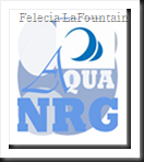
My first attempt is a simple yet obvious design, I think. Using photo-editing software called Gimp, I started off with four circles. The three in front of the larger signify bubbles; which signify water. I used only two fonts for this logo; Rockwell Extra Bold, Ultra-Bold, and Vivaldi Italic Condensed. I was satisfied with this version, but seen many other possibilities. There was also a problem with the NRG in the logo. Although it may be obvious to some, a reason had to come of these letters so that everyone could understand the meaning of them. Aqua Natural Resource Generator; also seen as Aqua NRG (Energy).

image


Aqua Natural Resource Generator II (Aqua Energy)
Aqua Natural Energy Resource is an imaginary company that produces energy through means of water; the energy source is natural and comes from a water filtering energy generator. This logo is my second attempt; with less detail so that it is printer-friendly and simplified. The A in the logo remains the same so that it has a trademark. The colors will always be various shades of blue to keep the water-like effect. For this logo I used the MS Pmincho and Vivaldi Italic Condensed fonts.

image


Aqua Natural Resource Generator III (Aqua Energy)
The final version of my imaginary company logo is a version that eliminates confusion of the NRG. I wanted NRG to sound like energy, at the same time as having a meaning. I used only the Vivaldi Italic Condensed font, and I spelled out the meaning of NRG. I wanted to keep the A the same; to keep it connected to the original. I am happy with the results of all three attempts, but the most with my final version.

image
image

image


Works Cited

"Logo Design History." Logo Design Works. Web. 30 Sept. 2013. http://www.logodesignworks.com/blog/logo-design-history.


"Logo." Dictionary.com. Dictionary.com. Web. 30 Sept. 2013. http://dictionary.reference.com/browse/logos.

"Coca-Cola Logo." - History of at LogoBlog. Web. 30 Sept. 2013. http://www.logoblog.org/coca_cola_logo.php.

"125 Years of Coca-Cola Logos." Coca-Cola GB. The Coca-Cola Company. Web. 30 Sept. 2013. http://www.coca-cola.co.uk/125/history-of-coca-cola-logo.html.
Thursday, September 26, 2013

Advanced Essay 1: Applied Aesthetics

Visual Literacy
“Mimetic, pragmatic, expressive and objective theories” are four elements or theories of art that give poetry a purpose; suggested by Meyer H. Abrams. According to the website Scribd: Literary Theories by Adepeju Temitope Adenle, in poetry, Mimetic Theory is the universe, Pragmatic Theory is the audience, Expressive Theory is the artist or author, and Objective Theory is the text. (Adepeju, 2013)


At virtual.clemson.edu you will find a PDF titled The Orientations of Criticism after Meyer H. Abrams. This PDF states that Mimetic Theory, or mimicry, is poetry that is criticized by its relation to nature, its subject matter, accuracy, imitations of history, etc. Pragmatic Theory is poetry that is criticized by its function of art, what this poem teaches, what rules of poetry that are followed, etc. Objective Theory is poetry criticized by its definition, the terms that poetry is defined under, etc. Expressive Theory is poetry that is criticized by the nature of the creative process, reason, imagination, etc. (Abrams, 2013)


The type of artist/author (Expressionist), type of poem (Objective), who the poem is created for (Pragmatic), and how it relates to the world (Mimetic), are the blueprints of a poem. Poets apply aesthetics to obtain certain desired effects in whatever medium they are working with by understanding each of Meyer Abrams theories for criticizing a poem. Media artists who create images in videos, film, or television consider both aesthetics and ethics in their work; however, the same theories can apply to these forms of art. Media artists are also criticized by Mimetic, Pragmatic, Expressive and Objective Theories. What I think is most important in a work of art is form, content, truthfulness, and ethical qualities; however, I feel that content can represent ethical qualities, form, and truthfulness if that is the artists objective. Truthfulness is the critical concept because many people are strongly influenced by media. While there are also many people that believe media has a negative effect on the population, I believe these negatives could be prevented. Fictional art/poetry is stretching the truth, but usually follow many of the same rules that apply in non-fictional art/poetry. (Abrams, 2013)

The media arts are used for many things such as; advertising, news, sports, educational purposes, and much more. The most valuable thing a media artist can do is to help with causes like cancer, childhood diseases, peace, etc. These artist not only have a talent for drawing a viewer’s attention, they also have the power to use it for a good cause. Programs like the Cure Cancer Starter make the numbers for funding a disease like cancer grow much higher then they would without media art. This program gives people the boost that they need to make a difference in cancer treatment. This website includes a list of cancer centers, inspirational media, a glossary of cancer terms, and more. (curecancerstarter.org, 2013)

All together, poets and media artists come in all types; having nearly the same choices and are also being criticized by nearly the same audience. The content in poems and media should always represent ethical qualities, form, and truthfulness; as well as having an understanding that most work is judged by Meyer H. Abrams’s Mimetic, Pragmatic, Expressive and Objective Theories. In poetry, the poet wishes to inspire a general or specific audience, about a general or specific idea, in a way that is familiar to the intended audience. Following Abrams theories can help get the right point across to the right people, the right way.

Works Cited


Adepeju, Adenle Temitope. "Classification of Literary Theories." Scribd. Adenle Adepeju, 27 Mar. 2013. Web. 26 Sept. 2013. http://www.scribd.com/doc/53401162/Classification-of-Literary-Theories.
Abrams, Meyer H. "The Orientations of Criticism." Virtual Clemson Education. Web. 26 Sept. 2013. http://virtual.clemson.edu/groups/dial/litcrit/abrams.pdf.
"Cure Cancer Starter." Cure Cancer Starter. Web. 15 Sept. 2013. http://www.curecancerstarter.org/.

Wednesday, September 25, 2013

M1 Illustration Assignment

 
Written Component: In the essay describe your concept, process, choices, materials and how it all relates to the module readings.
Drawing Component: Before you begin your selected illustration, write a short brief and then present it along with your final two projects.
 
Family Portrait
For my family portrait I was going to do all eight of my primary family including myself, however I realized that it was far too many people with far too much detail. I am a bit out of practice, but I am going to create a cartoon-like portrait of my three-year-old boys Gabriel and Nathaniel. Below are pictures of them, followed by a hand-drawn example of my out-of-practice sketching. This drawing is just a draft without personality gestures.
Holloween 007 (2)293707_3378283187944_1381914728_n
PICT0050 
 

Poster
Illustrate a small poster advertising an upcoming event in your community or neighborhood.
Procedure:  Knowing where the printed illustration is to appear, at what size, will it be in black and white or in color, there should be basic aspects to the brief. Remember that posters are to be seen quickly, so keep your  images simple and eye catching. First, write a short brief. Second, practice some figure drawing. Next, do several small thumbnail sketches using pen or pencil in your sketchbooks for your project. Be very free and creative while sketching in your sketchbook. Do not limit your ideas or possibilities, be free to write on or collage any ideas onto your pages. Work with the independent created elements and visuals from the sketch stage, to build up a range of test compositions. Cropping is a helpful tool, simply draw a rectangle line around your image and that can suggest the page edge. This can create a more dynamic focus.  
  • your briefs
  • copies of your thumbnail sketches
  • final projects
  • written responses (essays)

Seeing With the Camera

Saratoga Casino & Raceway

I live in Gansevoort, New York, and the place my family likes to go, for something to do on the regular, is Saratoga Springs, New York. Occasionally we go to the Saratoga Casino and Raceway. If we have the kids, we watch the horses race and bet on which will be the winner; our boys are three, so they love it! If it’s just the adults, the casino is a great place to loose money.


PICT0017

Saratoga Casino & Raceway, Sep. 27, 2013

There are many sensory impressions in this scene, such as; smells, visuals, bodily sensations, sounds, and more. The smell that I picked up on the most was the scent of outdoors after it rains; it is one of the best scents in the world. There were all sorts of sounds, like; people talking, cars coming and going, birds chirping, horns blowing, races starting, and my boys talking to me. The bodily sensations came also; excitement from the thrill of the chance to “win big”, the happiness of seeing my boys get excited to see the horses, and the thought of salty and cheesy warm pretzels that were just inside the entrance doors. The visual of the Saratoga Casino and Raceway is inviting; with crowds of familiar hometown faces, the large entrance, well maintained landscaping, and much more for entertainment than you can handle. My emotional response was hair-standing up excitement, and there is no other way for me to describe it. The quality of light, or "lines", in the scene was high. The entrance was designed so that the light from the sun could shine through the whole thing. The background is mostly cut away from this photograph, and I encased the foreground by the trees in the landscape.

There were not many details that I didn't notice in this scene before I took this photograph; accept a couple people and the sprinkler system out front. The lighting in this photograph was much darker before I altered it; there was a dark cloud over the building and I had very impatient little boys tugging me to continue forward. The "lines" in the scene were captured in every angle, with each object leading you inside of the building. The focus in this photograph was a little blurry, but exceptional in comparison to what I was getting at first. The color quality between the actual scene and the photograph was also better seen through the camera’s eye. This photograph presents the appearance of motion by showing the traffic in and out of the building and passing by the front of it. What I had seen in this photograph was better than I remember seeing it because I will now be able to see every detail for as long as I have the picture.


PICT0019

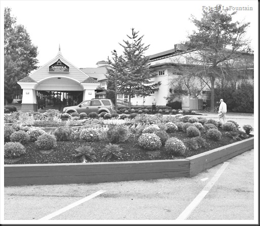
Saratoga Casino & Raceway, Sep. 27, 2013

This is a photograph of the Saratoga Casino and Raceway as we are leaving it; the scene is sad, to express my emotion with it. The main details that I didn't notice in this photograph were the shapes and lines within it. The lighting in this photograph was perfect. The "lines" in the scene were almost abstract; seemingly bending in unusual ways. The focus in this photograph was exactly how I wanted it to be captured. The color quality between the actual scene and the photograph was clearly different in that I used a black and white effect to symbolize that we were leaving this place but wished that we were not. This photograph presents the appearance of motion by pulling away from the first picture that is shown, the people walking, and the vehicle approaching the main entrance. What I had seen in this photograph was better than I remember seeing it because this image blocks out the rest of what I could see outside of the photograph; it captures the scene I want you to picture.


PICT0013

Stewart Shop, Sep. 27, 2013

This is the last store on the way home from a long day of “no-such-luck”, but a lot of fun trying. I captured this image because there was more motion in this little gas station then there was at the Saratoga Casino and Raceway today. The one detail that I didn't notice in this photograph is the blow-up shark on top of the big white van. The lighting in this photograph was great, and the "lines" in the scene were also. The focus in this photograph was a little blurred from the distance that I had captured it in. The color quality between the actual scene and the photograph was identical. This photograph presents the appearance of motion by showing the very regularly fast-paced and local Stewarts Shop; many gas stations usually are very busy on a regular. What I had seen in this photograph was the same as I remember seeing it with my own eyes.


Overall, these photographs represent a great day with a lot of excitement and detail. While taking these photos I used all of my senses and emotions, and realized just how many of them come from just one moment and one picture. I will always have these photographs to remember the day.

Examples of Food Menus or Supermarket

According to Arthur Berger’s Signs in Contemporary Culture: An Introduction to Semiotics, our culture or “culture-code” explains what creates our understanding and behavior, filtering through how we make selections in food, education, clothing, etc. Food choices are greatly influenced by culture, therefore our culture is defined by what we eat as well. Where you are from usually defines what you eat, or what you eat is what really defines your culture. (Berger, 1999)

In America, what is purchased by the majority of us is considered our low-status foods, and what is uncommonly purchased to the majority is considered our high-status foods. Arthur Berger states that foods like chicken, white meat, cut up or ground, or foods that are canned and bottled, fried, boiled, covered in sauce or gravy, are all considered to be “high-status foods”. Foods like steak, roast beef, homemade, and foods that are served roasted or broiled are considered to be “low-status foods” (215). Social upbringing creates familiar foods combinations, types, how they are prepared, the order that we eat each type of meals, and meal-times. How and where we live, religion, nurture and nature are all a big part of what determines our attitudes toward the foods we eat. (Berger, 1999)

The Olive Garden is an Italian food restaurant that has many locations in America. The menu is designed similar to the colors and look of a garden; very Earthy. The lunch menu at Olive Garden consists of appetizers such as; Bruschetta, Lasagna Fritta, Sicilian Scampi, Calamari, and Stuffed Mushrooms. The meals include pizza, calzone, soups, salads, beef, pork, chicken, and more of the common Italian foods that most Americans have come to know and love. The Lecirque, a French restaurant, has a menu with many bright and colorful foods. The lunch menu consists of appetizers such as; Lobster Risotto, Sweat Corn Soup, Spinach Fettuccine, and also Italian dishes like ravioli and spaghetti.

As Arthur Berger states in chapter twenty-six; Americans look at eating as “functional and obligatory”, and the French look at it as a “source of sensual pleasure” (213). The menu for the French restaurant Lecirque is much more appealing to the eye than the American restaurant the Olive Garden; it has much more detail put into it. The Olive Garden is much simpler, and the foods all look like nearly the same dish. The way that the menu styles and choices are for each restaurant reinforces the culture-codes of each country. (Berger, 1999)

I grew up on pasta, hamburger, chicken, beef, eggs, fish, salads, dairy, and all that you would find on the food pyramid that we are taught in American schools; having a large influence on my food choices today. The manner in which products are organized and displayed, and how space is orchestrated to walk the consumer through the store is based on popular demand; although many different cultures can shop at the market for the foods of their preference, a higher quantity of the popular/highly-available product takes greater space. Digital History says that we were introduced to doughnuts, barbeque, cole slaw, hamburgers, and hot dogs by German immigrants.


Works Cited

Berger, Arthur Asa. "Chapter Twenty-Six: Characteristics of Codes." Signs in Contemporary Culture: An Introduction to Semiotics. 2nd ed. Salem: Sheffield, 1999. Print.

"Le Cirque - Dining Room Dinner." Le Cirque - Dining Room Dinner. Web. 25 Sept. 2013. http://www.lecirque.com/menu_locu.

"Find a Restaurant." Olive Garden Italian Restaurants. Web. 25 Sept. 2013. http://www.olivegarden.com/Menu/Lunch/.

Mintz, Steven. "Digital History." Digital History. Web. 25 Sept. 2013. http://www.digitalhistory.uh.edu/historyonline/food.cfm.

Thursday, September 19, 2013

Week 2: Student-Led Discussion

Examples of Advertising or Editorial Photographs

I now have a better understanding of visual communication being so important and influential to our values, personal identity, taste in style, ethics, etc. This happens to us because of visual phenomena being so connected each of this parts of us intellectually and emotionally, reflecting and affecting each aspect. Understanding this can and has been used to manipulate people into looking and being a certain way. 

Arthur Berger’s Seeing is Believing, page 23, has a list of examples of the signifier and signified in advertisements. The signifier is a sign or characteristic in an image that leads the viewer to come to a meaning for that sign; the signified.

Calvin Klein

http://luxurylabs.wordpress.com/2009/08/31/more-male-models/

The first advertisement that I chose to display is by Calvin Klein (Found in many magazines), advertising jeans for both men and women. The models that are posed have a wet-and-messy look to them, great physique, and displaying sexual desire. Many advertisements use sex appeal to attract an audience. The photographer of this image used markers such as the wet and messy hair to be more appealing to the mature audience. The sender of the image is Calvin Klein Jeans, the message is to wear Calvin Klein Jeans to look sexy, the receiver is any person with the desire to be attractive, the code used is male and female models, and the contact is photographic advertising.

Signifier: Marker

Wet and messy hair

Shirtless

Signified: Meaning

Wild personalities

Sex-appeal

Sender: Sends Message

Calvin Klein Jeans

Message: Content

Wear Calvin Klein Jeans and you will look sexy

Receiver: Audience

People with the desire to be attractive, and feel that these jeans will help with that.

Code: Form (Language, Images, Sound)

Male and female models

Black and white

English

Contact: Medium

Photographic advertising


“Gay Valentine’s Day”- Armani Exchange

http://hinterlandgazette.com/2010/02/armani-exchange-gay-valentines-day-ad.html

The second advertisement that I chose is by Armani Exchange, which is a clothing company. For this advertisement, they chose to attract the gay audience; stirring up mixed emotions. The website that I located the advertisement on had an article of complaints to take this ad down due to is displaying “soft porn”, while I am sure many other’s were grateful for the display. If you look closely, you will see that the male and female in the center of the photo are the same two featured on the left and right with a model of the same sex. The two in the center are wearing sunglasses to make this harder to recognize.

Signifier: Marker

Affection

Gay and straight models

Signified: Meaning

Brings people close

Attracts “gay” audience

Sender: Sends Message

Armani Exchange

Message: Content

Wear Armani Exchange clothing

Receiver: Audience

Men and women, both gay and straight; for cloths that will bring you closer to the one you want.

Code: Form (Language, Images, Sound)

Male and female, gay and straight, models

Black and white

English

Contact: Medium

Photographic advertising

In terms of physical features of the models that are used in these advertisements, I saw no real difference; many advertisements use the same tricks, which are human desires more than any. The manner that men are shown, relating to women, is strong, healthy, etc. for the female audience, and woman are portrayed in ways that please the male audience. Details included in these picture such as the wet hair and the affection show that sexual desire and the need for human contact is an important thing for many people, and visual phenomena is used to draw these feelings out; leading people to believe that a product will change how you appear to other people, so you will buy their product. What these magazines are saying about the models portrayed and the audience reading their publications is that they are the idealistic image, and people should look like them.

Works Cited

Proctor, Lauren. "More Male Models «." Luxurylabs Wordpress. N.p., 31 Aug. 2009. Web. 22 Sept. 2013. http://luxurylabs.wordpress.com/2009/08/31/more-male-models/.

Shan, Janet. "Armani Exchange "Gay" Valentine’s Day Ad Sparks Controversy Among Some Mothers." The Hinterland Gazette. N.p., 08 Feb. 2010. Web. 22 Sept. 2013. http://hinterlandgazette.com/2010/02/armani-exchange-gay-valentines-day-ad.html.

Berger, Arthur Asa. "Chapter One: Seeing Is Believing." Seeing Is Believing: An Introduction to Visual Communication. 4th ed. Mountain View, CA: Mayfield Pub., 1998. 23+. Print.