Thursday, October 3, 2013

Field Trip Discussion: Digital Photography School

First off, I would like to apologize for such a late post.

My Visual Literacy class is working with a book by Mark Wigan called The Visual Dictionary of Illustration, and this book defines photography as “the art of using a camera to capture an image on a light-sensitive plate via the chemical action of light’ and that illustrators use it for gathering “visual reference material”. It also states that the Greek words photos and graphos mean light and drawing. (Wigan, 2009)

In Michael Freeman’s The Photographer’s Eye: Composition and Design for Better Digital Photos, page 129 of chapter five Intent it says that, “To make an identifiable difference to the style of an image, the techniques used need to be definite rather than subtle.”, and that most stylistic techniques are limited. Although this may be true, it is good to know how to use a digital camera and the settings can be very confusing to new users. (Freeman, 2007)

The Digital Photography School is a great site to learn all about photography “basic”. You can start with The Basics of Exposure, which includes but is not limited to; exposure, ISO, shutter speed, aperture, and more. In Learning about Exposure – The Exposure Triangle, it gives examples of understanding how the three elements that make up the exposure all work, which are: ISO (“The measure of a digital camera sensor’s sensitivity to light.”), Aperture (“The size of the opening in the lens when a picture is taken.”), and Shutter Speed (“The amount of time that the shutter is open.”). (Digital Photography School, 2013)

The Digital Photography School also has tutorials for Learning to Use Digital Camera Settings and Features, which includes; controlling aperture and shutter speed, about aperture and shutter priority modes, white balance, about digital camera modes, understanding histograms, and more. One part that I found helpful was the explaining of aperture and shutter symbols; it states under  Aperture and Shutter Priority Modes, that aperture usually has an A or Av symbol to show that it has selected and set the aperture you choose, and the shutter usually has a TV or a S symbol while choosing the shutter speed that you want. (Digital Photography School, 2013)

The Digital Photography School also includes tutorials for Handling and Caring for a Digital Camera, which explains how to hold a digital camera, how to clean a DSLR lens, predator warnings, and more; along with Other Beginner Photography Tutorials and Tips, and Common Digital Photography Problems and Questions Answered. I chose to look further into The Basics of Exposure: Learning about Exposure – The Exposure Triangle, and Learning to Use Digital Camera Settings and Features: Aperture and Shutter Priority Modes because they were the most helpful to me at this time, expanding my knowledge about, and how to use, a digital camera. (Digital Photography School, 2013)

Works Cited

Wigan, Mark. "Photography." The Visual Dictionary of Illustration. Lausanne: AVA, 2009. 174. Print.

Freeman, Michael. "Chapter 5: Intent." The Photographer’s Eye: Composition and Design for Better Digital Photos. Waltham, MA: Ilex, 2007. 129. Print.

"Digital Photography Tips for Beginners." Digital Photography School Digital Photography Tips for Beginners Comments. N.p., n.d. Web. 04 Oct. 2013. http://digital-photography-school.com/digital-photography-tips-for-beginners.

 

Sign Systems: Examples of Advertisements, Posters, or Billboards


Semiotics is a field of study to help us understand how visual phenomena communicates. Signs have meaning because of analogy and association (metaphors and metonymies). On page thirty-five of Arthur Asa Berger’s Signs in Contemporary Culture: An Introduction to Semiotics, there is a chart giving examples of the differences between a metaphor and a metonymy. A metaphor is a similarity; and a metonymy is a proximity or well-known symbol of something in particular. Many advertisements use metaphors (“happy is up, sad is down”) and metonymies (“smoke means fire”, pink ribbon means breast cancer, etc.) to sell a product or election campaigns.

signifier and signified


http://blog.karachicorner.com/2012/10/50-dazzling-advertising-posters-with-clever-ideas/

Dazzling Advertising Posters with Clever Ideas 11

Neckties shaped like sushi is a great advertising example. Tokyo is in Japan, where sushi is well known. Although they are not sushi, because they are intentionally shaped like so, we immediately think of sushi anyways. Adding a set of chopsticks lets us know that it was the intension of the designer to do this to our vision of the product. It is a very clever advertisement. The relationship between image and text is solid. The image and text compliment each other completely. Metaphor and metonymy play a role in this advertisement because of the connection between the image and text. The ties shaped like sushi are a metaphor for Tokyo , sushi is a metonymy for Tokyo.


http://www.gastongazette.com/opinion/cartoons/daily-political-cartoon-8-11-13-1.184813

daily-political-cartoon-8-11-13

This political advertisement features “Obama” as the server at the “USA Diner”, serving different variations of meals to three guys that are labeled as “BIG GOVT.”, “MIDDLE CLASS”, and “OBAMANOMICS”. The “BIG GOVT.” is served high-class, as they are seen, heavily fed, wearing suits, “fine-dining”, and showing their wealth. The cartoon also has a well-trimmed hair-cut, a bib, and what I am guessing is wine with his meal. The “OBAMANOMICS” (Lower-class) guy is also eating a lot, but he is eating unhealthy fast-foods, and his hair-cut and clothing are less “clean-cut”. The “MIDDLE CLASS” guy is very thin, being served only a salad by “Obama”, and being squished by the other two guys. The suggestions that are being used as reference to personify each class has become both metaphors metonymies for each of them.


http://mass2networked.blogspot.com/2012/04/advertising-women-and-media.html

These fast food advertisements are all sexual-innuendoes that are cleverly set up, subliminal messages, that mislead people to think that fast food and beauty are some how related. We all know that fast food is very unhealthy. The relationship between image and text is very well thought out, so that most people get the inside joke while also seeing a harmless side.


http://blog.karachicorner.com/2012/06/40-stunning-print-media-ads/

40+ Stunning Print Media Ads

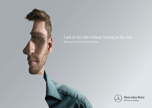
I also wanted to share this Mercedes-Benz advertisement, simply because of how clever its design is. It is of both a frontal and side view of a mans face merged. The text reads “Look to the side without looking to the side”, which fits the merging of the faces. The image is a metaphor for the text, and a metonymy for the technology that is being advertised.


Works Cited

Admin. "50 Dazzling Advertising Posters with Clever Ideas." Design Blog RSS. 18 Oct. 2012. Web. 04 Oct. 2013. http://blog.karachicorner.com/2012/10/50-dazzling-advertising-posters-with-clever-ideas/.


Wash. Poet Writers Group. "Daily Political Cartoon 8/11/13 - Cartoons - Gaston Gazette."Daily Political Cartoon 8/11/13 - Cartoons - Gaston Gazette. Halifax Media Group, 07 July 2013. Web. 04 Oct. 2013. http://www.gastongazette.com/opinion/cartoons/daily-political-cartoon-8-11-13-1.184813.


"From Mass to Networked." : The Drive to Be Thin--Women in Advertising. 24 Apr. 2012. Web. 04 Oct. 2013. http://mass2networked.blogspot.com/2012/04/advertising-women-and-media.html.


Admin. "40 Stunning Print Media Ads." Design Blog RSS. Web. 04 Oct. 2013. http://blog.karachicorner.com/2012/06/40-stunning-print-media-ads/.

Illustration (Mod. 2)

Discussion: There is still a great deal of power in the pencil, as a matter of fact, the pencil, in a very broad sense, defines the illustration process. The teaching of drawing can vary from one art school to another, but all agree that foundational drawing skills are a very important discipline. Drawing can be used for pleasure, note taking, recording, representing, planning and portraying. It can be observational or interpretive. It can reflect a moment, a movement, or simply convey information. One can draw with almost anything that can make a mark - pencil, brushes, colored pencils, pastels, charcoal, paint, or markers. One can create drawings in color on the computer, using an application such as Adobe Photoshop, with the freedom and flexibility to make changes and alterations throughout the project.

QUESTION: With all the technology available today, do you still feel it is important for the illustrator to be able to draw well and why? Please include references from the readings to back up your argument

Essay Two - Techniques (due end of week 4) Techniques


Understanding and applying the controls available on the camera.

Select examples of photographs that exemplify shallow depth of field, greater depth of field, stop motion, blurred motion, and panning.

Analyze the images and suggest ways in which the effects were achieved.

Did the photographer use fast or slow film?

Was a fast or slow shutter speed used?

Was the lens opening large or small?

How did the position of the photographer effect the final image?

Describe the technical challenges faced by the photographer including bracketing exposures, substitution reading, metering up close, subject against bright or dark background, and choice of film speed (ISO).

Freeman, Ch. 5 + pages 156-160

Saturday, September 28, 2013

LOGO Project


image

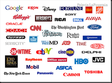
A logo is a symbol created for a company, group, or organization (Dictionary.com). Logo’s have been around for a long time; Ezine Articles states that the first people who used logos (symbols) as a means for communication, consisting one or more letters, are the ancient Greeks. To keep it up-to-date, a good example of a logo that fits is Coca Cola’s. Although the logo has undergone some various alterations, the font has basically stayed the same.

The first Coca-Cola logo was created by Frank Mason Robinson, in 1885. Thinking that the two Cs would be great in advertising, Robinson came up with the name and chose the logo’s distinctive cursive script. The typeface that he used was the dominant font of it’s time known as Spencerian script This font was developed in the mid 19th century. “The red and white colored scheme in the Coca-Cola logo was kept simple and distinctive to lure young minds.” The Coca-Cola logo was advertised for the first time in the Atlanta Journal in 1915 and on the display of Pemberton’s pharmacy. The Coca-Cola logo was registered as a trademark in 1887 stands today as the brand’s corporate identity.


“Aqua N.R.G. (Natural Resource Generator)”
By Felecia LaFountain

image


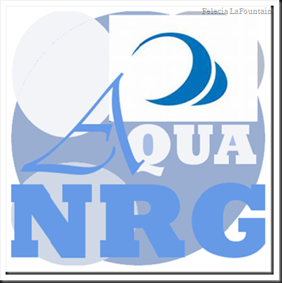
Aqua Natural Resource Generator (Aqua Energy)
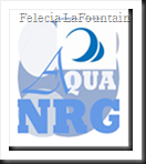
My first attempt is a simple yet obvious design, I think. Using photo-editing software called Gimp, I started off with four circles. The three in front of the larger signify bubbles; which signify water. I used only two fonts for this logo; Rockwell Extra Bold, Ultra-Bold, and Vivaldi Italic Condensed. I was satisfied with this version, but seen many other possibilities. There was also a problem with the NRG in the logo. Although it may be obvious to some, a reason had to come of these letters so that everyone could understand the meaning of them. Aqua Natural Resource Generator; also seen as Aqua NRG (Energy).

image


Aqua Natural Resource Generator II (Aqua Energy)
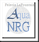
Aqua Natural Energy Resource is an imaginary company that produces energy through means of water; the energy source is natural and comes from a water filtering energy generator. This logo is my second attempt; with less detail so that it is printer-friendly and simplified. The A in the logo remains the same so that it has a trademark. The colors will always be various shades of blue to keep the water-like effect. For this logo I used the MS Pmincho and Vivaldi Italic Condensed fonts.

image


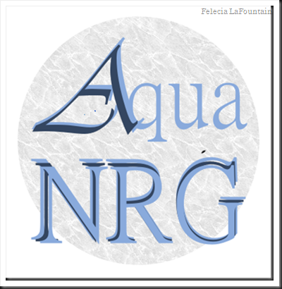
Aqua Natural Resource Generator III (Aqua Energy)
The final version of my imaginary company logo is a version that eliminates confusion of the NRG. I wanted NRG to sound like energy, at the same time as having a meaning. I used only the Vivaldi Italic Condensed font, and I spelled out the meaning of NRG. I wanted to keep the A the same; to keep it connected to the original. I am happy with the results of all three attempts, but the most with my final version.

image
image

image


Works Cited

"Logo Design History." Logo Design Works. Web. 30 Sept. 2013. http://www.logodesignworks.com/blog/logo-design-history.


"Logo." Dictionary.com. Dictionary.com. Web. 30 Sept. 2013. http://dictionary.reference.com/browse/logos.

"Coca-Cola Logo." - History of at LogoBlog. Web. 30 Sept. 2013. http://www.logoblog.org/coca_cola_logo.php.

"125 Years of Coca-Cola Logos." Coca-Cola GB. The Coca-Cola Company. Web. 30 Sept. 2013. http://www.coca-cola.co.uk/125/history-of-coca-cola-logo.html.

Thursday, September 26, 2013

Advanced Essay 1: Applied Aesthetics

Visual Literacy
“Mimetic, pragmatic, expressive and objective theories” are four elements or theories of art that give poetry a purpose; suggested by Meyer H. Abrams. According to the website Scribd: Literary Theories by Adepeju Temitope Adenle, in poetry, Mimetic Theory is the universe, Pragmatic Theory is the audience, Expressive Theory is the artist or author, and Objective Theory is the text. (Adepeju, 2013)


At virtual.clemson.edu you will find a PDF titled The Orientations of Criticism after Meyer H. Abrams. This PDF states that Mimetic Theory, or mimicry, is poetry that is criticized by its relation to nature, its subject matter, accuracy, imitations of history, etc. Pragmatic Theory is poetry that is criticized by its function of art, what this poem teaches, what rules of poetry that are followed, etc. Objective Theory is poetry criticized by its definition, the terms that poetry is defined under, etc. Expressive Theory is poetry that is criticized by the nature of the creative process, reason, imagination, etc. (Abrams, 2013)


The type of artist/author (Expressionist), type of poem (Objective), who the poem is created for (Pragmatic), and how it relates to the world (Mimetic), are the blueprints of a poem. Poets apply aesthetics to obtain certain desired effects in whatever medium they are working with by understanding each of Meyer Abrams theories for criticizing a poem. Media artists who create images in videos, film, or television consider both aesthetics and ethics in their work; however, the same theories can apply to these forms of art. Media artists are also criticized by Mimetic, Pragmatic, Expressive and Objective Theories. What I think is most important in a work of art is form, content, truthfulness, and ethical qualities; however, I feel that content can represent ethical qualities, form, and truthfulness if that is the artists objective. Truthfulness is the critical concept because many people are strongly influenced by media. While there are also many people that believe media has a negative effect on the population, I believe these negatives could be prevented. Fictional art/poetry is stretching the truth, but usually follow many of the same rules that apply in non-fictional art/poetry. (Abrams, 2013)

The media arts are used for many things such as; advertising, news, sports, educational purposes, and much more. The most valuable thing a media artist can do is to help with causes like cancer, childhood diseases, peace, etc. These artist not only have a talent for drawing a viewer’s attention, they also have the power to use it for a good cause. Programs like the Cure Cancer Starter make the numbers for funding a disease like cancer grow much higher then they would without media art. This program gives people the boost that they need to make a difference in cancer treatment. This website includes a list of cancer centers, inspirational media, a glossary of cancer terms, and more. (curecancerstarter.org, 2013)

All together, poets and media artists come in all types; having nearly the same choices and are also being criticized by nearly the same audience. The content in poems and media should always represent ethical qualities, form, and truthfulness; as well as having an understanding that most work is judged by Meyer H. Abrams’s Mimetic, Pragmatic, Expressive and Objective Theories. In poetry, the poet wishes to inspire a general or specific audience, about a general or specific idea, in a way that is familiar to the intended audience. Following Abrams theories can help get the right point across to the right people, the right way.

Works Cited


Adepeju, Adenle Temitope. "Classification of Literary Theories." Scribd. Adenle Adepeju, 27 Mar. 2013. Web. 26 Sept. 2013. http://www.scribd.com/doc/53401162/Classification-of-Literary-Theories.
Abrams, Meyer H. "The Orientations of Criticism." Virtual Clemson Education. Web. 26 Sept. 2013. http://virtual.clemson.edu/groups/dial/litcrit/abrams.pdf.
"Cure Cancer Starter." Cure Cancer Starter. Web. 15 Sept. 2013. http://www.curecancerstarter.org/.